Why Create a Custom Language Selector?
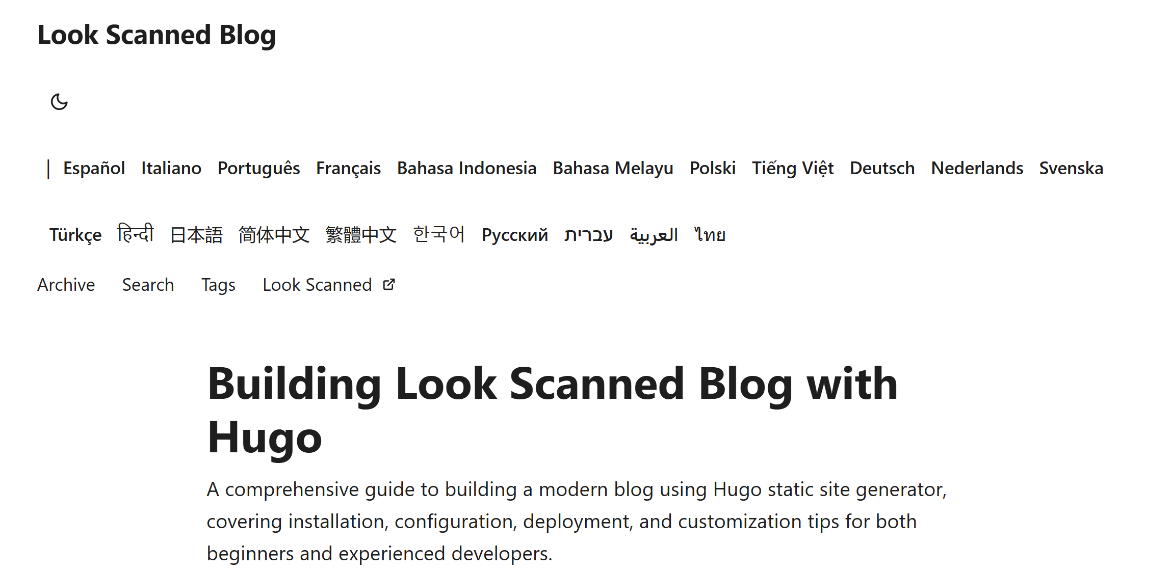
While Hugo PaperMod theme includes a built-in language selection feature, it simply displays all available languages in the header. For blogs supporting numerous languages (like Look Scanned, which supports over 20), this approach clutters the header with language options. A custom dropdown-based language selector provides a more elegant solution.
Implementation Guide
Locate and Override the Original Layout
The original language selector is defined in themes/PaperMod/layouts/partials/header.html. To customize it, we need to create our own version at layouts/partials/header.html. Here’s the original implementation:
{{- $lang := .Lang}} {{- $separator := or $label_text (not
site.Params.disableThemeToggle)}} {{- with site.Home.Translations }}
<ul class="lang-switch">
  {{- if $separator }}
  <li>|</li>
  {{ end }} {{- range . -}} {{- if ne $lang .Lang }}
  <li>
    <a
      href="{{- .Permalink -}}"
      title="{{ .Language.Params.languageAltTitle | default (.Language.LanguageName | emojify) | default (.Lang | title) }}"
      aria-label="{{ .Language.LanguageName | default (.Lang | title) }}"
    >
      {{- if (and site.Params.displayFullLangName (.Language.LanguageName)) }}
      {{- .Language.LanguageName | emojify -}} {{- else }} {{- .Lang | title -}}
      {{- end -}}
    </a>
  </li>
  {{- end -}} {{- end}}
</ul>
{{- end }}
Create the Custom Dropdown Selector
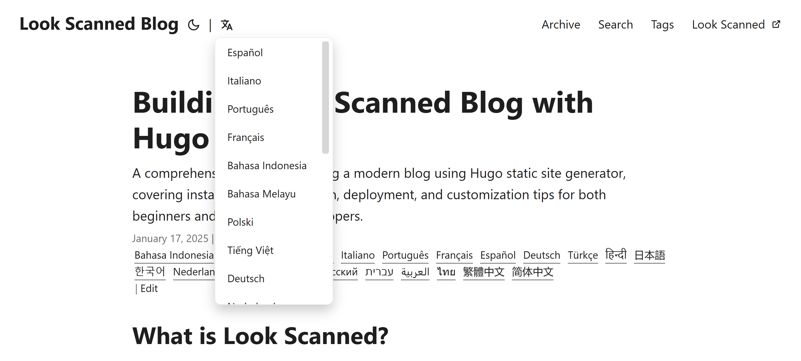
Our custom implementation uses a language icon from ionicons5 as a trigger button, which reveals a dropdown menu containing all available languages. Here’s the implementation:
{{- $lang := .Lang }}
{{- $separator := or $label_text (not site.Params.disableThemeToggle)}}
{{- with site.Home.Translations }}
{{- if $separator }}<span class="nav-separator">|</span>{{ end }}
<div class="lang-select-dropdown">
    <!-- Language Icon Button -->
    <button class="lang-select-dropdown-trigger" aria-label="{{- i18n "translations" | default "Translations" }}" type="button">
        <svg xmlns="http://www.w3.org/2000/svg" xmlns:xlink="http://www.w3.org/1999/xlink" viewBox="0 0 512 512" width="24" height="18"><path d="M478.33 433.6l-90-218a22 22 0 0 0-40.67 0l-90 218a22 22 0 1 0 40.67 16.79L316.66 406h102.67l18.33 44.39A22 22 0 0 0 458 464a22 22 0 0 0 20.32-30.4zM334.83 362L368 281.65L401.17 362z" fill="currentColor"></path><path d="M267.84 342.92a22 22 0 0 0-4.89-30.7c-.2-.15-15-11.13-36.49-34.73c39.65-53.68 62.11-114.75 71.27-143.49H330a22 22 0 0 0 0-44H214V70a22 22 0 0 0-44 0v20H54a22 22 0 0 0 0 44h197.25c-9.52 26.95-27.05 69.5-53.79 108.36c-31.41-41.68-43.08-68.65-43.17-68.87a22 22 0 0 0-40.58 17c.58 1.38 14.55 34.23 52.86 83.93c.92 1.19 1.83 2.35 2.74 3.51c-39.24 44.35-77.74 71.86-93.85 80.74a22 22 0 1 0 21.07 38.63c2.16-1.18 48.6-26.89 101.63-85.59c22.52 24.08 38 35.44 38.93 36.1a22 22 0 0 0 30.75-4.9z" fill="currentColor"></path></svg>
    </button>
    <!-- Dropdown Content -->
    <div class="lang-select-dropdown-content">
        {{- range . -}}
        {{- if ne $lang .Lang }}
        <a lang="{{ .Lang }}" href="{{- .Permalink -}}" title="{{ .Language.Params.languageAltTitle | default (.Language.LanguageName | emojify) | default (.Lang | title) }}"
            aria-label="{{ .Language.LanguageName | default (.Lang | title) }}">
            {{- if (and site.Params.displayFullLangName (.Language.LanguageName)) }}
            {{- .Language.LanguageName | emojify -}}
            {{- else }}
            {{- .Lang | title -}}
            {{- end -}}
        </a>
        {{- end -}}
        {{- end}}
    </div>
</div>
{{- end }}
Add the Styling
To make the dropdown work smoothly and look consistent with the theme, add the following CSS:
.lang-select-dropdown {
  position: relative;
  display: inline-block;
}

.lang-select-dropdown-content {
  top: 50px;
  display: none;
  position: absolute;
  background-color: var(--entry);
  border-radius: var(--radius);
  border: 1px solid var(--border);
  box-shadow: 0px 8px 16px 0px rgba(0, 0, 0, 0.2);
  z-index: 1;
  max-height: calc(min(20em, 100vh - 100px));
  overflow-y: auto;
  overflow-x: hidden;
}

.lang-select-dropdown-content a {
  font-size: 14px;
  font-weight: inherit;
  line-height: 1;
  padding: 12px 16px;
  text-decoration: none;
  display: block;
  white-space: nowrap;
  transition: background-color 0.1s ease-in-out;
}

.lang-select-dropdown-content a:hover {
  background-color: #f1f1f1;
}

.lang-select-dropdown:hover .lang-select-dropdown-content {
  display: block;
}

.lang-select-dropdown-trigger {
  height: 100%;
  font-size: 26px;
  margin: auto 4px;
}

.nav-separator {
  margin: auto 4px;
}
The result is a clean, dropdown-based language selector that appears when hovering over the language icon:
You can find the complete implementation in this GitHub commit.